Thursday 13 December 2012

CREATIVE TEESSIDE 2012

Brief
Creative Teesside is a magazine that features work from the School of Arts and Media students.'Subject matter is up to you - what do you find inspiring? - Your work environment, people around you, quirkiness, a clever idea, fun, intrigue, the beautiful as sensuous!' A maximum of three images could be used in either 3D, digital, print, photography or drawing. The initial design was to create a piece that would be used to promote the Creative Teesside Event.

My Design
Using the colours of the Teesside University logo, the colours express both creativity and brand. The quote used represents what a new student should think about the campus and also the work of other students.


CREATIVE TEESSIDE 2012 - HAYLEY SIMPSON 2012
 

Thursday 8 November 2012

ILLUSTRATION

Brief
Professional Communication - To design an image or brand for your self promotion.

My Design
For my Professional Communication module, we had to identify what designer we were. I had a huge passion for illustration but also found that I loved other design industries within graphic design. I finally decided on being a graphic design then an illustrator but I love designing illustrations and vectors as well as editorial and branding.  


SELF ILLUSTRATION - HAYLEY SIMPSON 2012

Friday 12 October 2012

TEESSIDE UNIVERSITY

Teesside University

I have finally started my first term at Teesside University studying my BA Hons in graphic design. I have started to focus on what I want to achieve by the end of the year and I have also become aware of what industry I need to focus on for my future career in graphic design.

Targets

> To start and complete my dissertation draft for submission
> To begin my Professional Communication module
> To start and complete my next project for Penguin Book Awards 2013

Tuesday 19 June 2012

END OF YEAR SHOW - SUMMER CREATIVE


SUMMER CREATIVE THEME 'MAD MEN' - FRANCIS FITZGERALD - 05/12

Summer Creative, End Of Year Show

The end of year show for Cleveland College of Art and Design has finally finished and so has my studying at this passion institute of art and design. Throughout the whole of the university courses created a theme that would represent their course of study and themselves as designers. For our course we decided on the theme of Mad Men, the 60's inspired television series about a advertisement agency in America. The course consisted of 11 students who all had a passion for their design work produced within the mac studios and institute. My overall experience at Cleveland College of Art and Design has been challenging but worth the struggle. Throughout the duration of my BTEC course in Middlesbrough and my FdA in Hartlepool over the past 4 years has been amazing. I have met amazing people along the way, making new friends and meeting creative designers within the industry of graphic design. If anyone was to look into studying a course for arts and design, this would be the place to study for either your BTEC or FdA.

Whats Next?

I have enrolled onto the top up year at Teesside University to continue my studies for my BA Hons. From there, I will be going out into the industry of graphic design as a designer for future client.


I wish everyone on my course good luck for their future plans and I hope to see many of you in the future.


Here are some images of the exhibition show that was available to the public during June 2012. 


Tuesday 22 May 2012

ECO-LABEL FASHION

Brief
A local fashion company specialising in creating economy clothing around the North East. The company were asking for a name that was trendy but also relates to their fashion clothing line. The company were only asking for a brand that could be applied to various platforms and medias.

My Designs
I wanted to generate an idea that would both show the companies economic values and fashion styles. The name Eco-Label is designed to make the company look and sound economic.


ECO LABEL FASHION - HAYLEY SIMPSON 2012

ECO LABEL FASHION - HAYLEY SIMPSON 2012

YCN AWARDS 2012

Brief
YCN Awards host a number of briefs open to students around the UK for large companies who either need a re-brand or a new promotional campaign to promote their products. This year was Graze.com, a healthy snack company who deliver postal boxes full of little snacks and treats to your office or home. Graze we asking for a re-brand that would be used to promote themselves to new customers. Once you had re-branded you were asked to apply this to the postal boxes that would be delivered to their customers and the design.

My Designs
I wanted to create a design that would bring the original logo back to nature. I decided upon changing the lettering to look similar to grass blades using a thin green stroke. A ladybug was then added along the G to represent the blade of grass and the closeness to nature that the company offer. The inside of the box was kept original with a similar image but the logo placed on the top left corner.


'14/05/2013 thoughts?
Looking back at this brief I should have re-designed the various leaflets that are supplied with the first box offering new promotions and discounts. I should have also developed the inside of the box to be more illustrative or creative to suit and fit my current portfolio.'


YCN AWARDS 2012 - HAYLEY SIMPSON 2012

PENGUIN BOOK AWARDS COMPETITION 2012

Brief
Penguin Book Awards host a competition to students to design book covers for upcoming releases of old novels. This years chosen novel was 'One Flew Over The Cuckoo's Nest'. This is an amazing read with a film that followed on starring Jack Nicholson. The story is written within a hospital ward for mentally ill patients run by Nurse Ratched.

My Design
The representation of cogs is to represent the cold, darkness of the hospital that these patients were subject to. With Nurse Ratched as the boss of the ward, she was described to run like clockwork with the patients.


ONE FLEW OVER THE CUCKOOS NEST - HAYLEY SIMPSON 2012


Monday 16 April 2012

WORK EXPERIENCE AT Q-DESIGN LTD

Q-Design Ltd
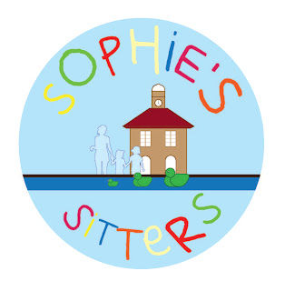
During the duration of work experience at Q-Design Ltd, it allowed me to boost my confidence and communication skills between the client and my employer. I thoroughly enjoyed working here for 5 days and would have preferred a longer placement. Over the period I was there, I designed for 3 clients around Teesside, LINX Project, Sophies Sitters and Parents 4 Change. My LINX Project was a fully printed final that went to the clients based in Hemlington who worked with young and old teenagers. 

SOPHIES SITTERS YARM - HAYLEY SIMPSON 2012


PARENTS 4 CHANGE AWARENESS & ACTION 'KID WITH ATTITUDE CAR SIGN' MIDDLESBROUGH - HAYLEY SIMPSON 2012


HEMLINGTON DETACHED YOUTH WORK PROJECT (LINX)- HAYLEY SIMPSON 2012