What's being happening?
It's being a while since I have posted a blog post so here it is! Since finishing my bachelors degree back in June 2013, I joined the millions of unemployed people in the UK. During the first 2 months I experienced ups and downs which I quickly tried to overcome. Whilst finishing my studying, I ended up in A&E after stupidly falling down the stairs that resulted in having to wear a cast for 9 weeks.
My confidence in finding a graduate job had plummeted and I eventually ran out of savings for me to live. My only option was to visit the local job centre and put in a claim for JSA. The first few weeks from making a new claim is tough and demanding. I remember having to look for over 10+ jobs a week in an area that has a deprivation of full time employment.
Every day was a constant cycle of looking on various job sites, handing my CV out to local companies and attending a course my adviser advised my to attend. I have successfully completed 2 courses and achieved a Customer Service Level 1 and BTEC ITQ Level 2 in IT. Once obtaining these qualifications my confidence and employment prospect grew.
Job Opportunity
I was nearing to the end of one of my courses when I had applied to an internship scheme that Teesside University were offering to recent graduates. I received an email confirming I had an interview and my application was successful! I'd already had other interviews for other jobs but they were always unsuccessful.
I remember waiting nervously in the waiting room for my panel interview, the thoughts going through my head saying how I needed this job and remembering the techniques I had read on career websites. The interview went well but I could have done better. I waited for a week and received the email that I had being successful in securing an internship with The West Middlesbrough Neighbourhood Trust. I met with Paul Wales, the operations director and he told me that one of us will be placed in the Know Your Money, Keep The Change Project. I was chosen to work alongside KYM.
Internship
The 6th of January had arrived and my first day of full time employment. The first few days were a challenge to get myself started within a new team but I found myself comfortable and in control with many of the projects that I was working on. Every 2 weeks I was required to attend Teesside University for sessions that would benefit and improve a persons employment prospect.
During my time at KYM, I have built and improved many skills and qualities that have made me more approachable to applying for jobs vacancies. Unfortunately because of funding, I wasn't able to be kept on at KYM. I now work as a volunteer part time in helping them improve their website and promoting events and sessions within the building.
So, yeah.. The past few months have been the worst and the best times of my life. I have improved various skills and qualities that have made me a much better person.

Monday, 7 April 2014

Tuesday, 14 May 2013
ROB HOWSAM LECTURE
Date
01/02/2013
Company
Purpose, London
This one one lecture that you could learn a lot from. Rob was an above average designer when it came to designing corporate identity and brand building. Rob has also been a judge for D&AD and Purpose use a quote that is both inspiring and driven.
'Purpose is a creativity, driven brand consultancy. We help our clients to build brands that stand out, connect and prosper.'
Lecture Notes
The World Is Changing
> More Knowledge
> More Choice
> More Power
> More Opportunity
> The only limit is our imagination: challenging times
> Brands and Businesses must change
> Think differently, don't follow the crowd
> Stand for something
> Connect with the brands, meaningful relationship with you
> Large companies listen to their consumers - this allows for better products in the future
> Relevant and Meaningful: Brand Experiences
> Brands are now more innovative
> Stay True - Branding is not marketing, they have to stay true to their consumers
> Stay Fresh - New ideas, keeping consumers entertained
> Collaborate - Working with various amounts of people and skills
> Be More Creative - Creativity is King, Imagination = £
The Six Fundamental Aspects
1: Embrace Change
2: Seek Opportunity
3: Ask Good Questions
4: Be Bold
5: Keep It Human (Simplicity is at the heart of good design)
6: Love What You Do
 |
| ROB HOWSAM LECTURE 2013 - HAYLEY SIMPSON 2013 |
YCN AWARDS 2013
Brief
YCN Awards host a number of projects that are open to students from large companies looking for either a re-brand or a new promotional campaign. GOJI Collective are a music promoter and merchandiser company set up for 18-25s who sell products for handheld devices such as an iPad and iPhone in Currys PC World. The brief asked students to design a pattern or design that would be applied to their new summer range starting in 2013. Part C required students to design a promotional campaign that would create a buzz to new and old customers either within the store or outside using a range of media platforms.
My Designs
My original designs for this project were lacking creativity and communication, so during April 2013, I re-designed my whole project using a different design that would be applied to the new products in summer 2013.
 |
| YCN AWARDS, GOJI COLLECTIVE - HAYLEY SIMPSON 2013 |
Wednesday, 17 April 2013
FINAL TERM - TEESSIDE UNIVERSITY
I haven't posted a blog post about the work I create for competition briefs in over a few months and I think it's about time I started to blog some more about my design experience. In over a month I will be joining thousands of other designers starting in the world of Graphic Design. I am truly looking forward to getting into the industry and building myself up into being a successful but also a productive designer. My 5 years of studying at 3 different institutes has being an amazing experience and I would highly recommend anyone going into studying to further their choice of employment for a better future. I have being gratefully thankful to all my tutors who have taught me various skills over the past 5 years and without their help I wouldn't have being able to understand who I wanted to be as a designer today.
Thursday, 4 April 2013
SELF PROMOTION
Brief
As part of the Professional Communication module, the brief asked to create a brand that would promote us into the graphic design industry.
My Design
The design is simple and bold. I wanted to create something that was relative to me and the use of red shows that I am passion for my design work and the industry of graphic design. The circle centres my logo and this is the brand for self promotion.
 |
| SELF PROMOTION - HAYLEY SIMPSON 2013 |
Thursday, 13 December 2012
CREATIVE TEESSIDE 2012
Brief
Creative Teesside is a magazine that features work from the School of Arts and Media students.'Subject matter is up to you - what do you find inspiring? - Your work environment, people around you, quirkiness, a clever idea, fun, intrigue, the beautiful as sensuous!' A maximum of three images could be used in either 3D, digital, print, photography or drawing. The initial design was to create a piece that would be used to promote the Creative Teesside Event.
My Design
Using the colours of the Teesside University logo, the colours express both creativity and brand. The quote used represents what a new student should think about the campus and also the work of other students.
Creative Teesside is a magazine that features work from the School of Arts and Media students.'Subject matter is up to you - what do you find inspiring? - Your work environment, people around you, quirkiness, a clever idea, fun, intrigue, the beautiful as sensuous!' A maximum of three images could be used in either 3D, digital, print, photography or drawing. The initial design was to create a piece that would be used to promote the Creative Teesside Event.
My Design
Using the colours of the Teesside University logo, the colours express both creativity and brand. The quote used represents what a new student should think about the campus and also the work of other students.
 |
| CREATIVE TEESSIDE 2012 - HAYLEY SIMPSON 2012 |
Thursday, 8 November 2012
ILLUSTRATION
Brief
Professional Communication - To design an image or brand for your self promotion.
My Design
For my Professional Communication module, we had to identify what designer we were. I had a huge passion for illustration but also found that I loved other design industries within graphic design. I finally decided on being a graphic design then an illustrator but I love designing illustrations and vectors as well as editorial and branding.
Professional Communication - To design an image or brand for your self promotion.
My Design
For my Professional Communication module, we had to identify what designer we were. I had a huge passion for illustration but also found that I loved other design industries within graphic design. I finally decided on being a graphic design then an illustrator but I love designing illustrations and vectors as well as editorial and branding.
 |
| SELF ILLUSTRATION - HAYLEY SIMPSON 2012 |
Friday, 12 October 2012
TEESSIDE UNIVERSITY
Teesside University
I have finally started my first term at Teesside University studying my BA Hons in graphic design. I have started to focus on what I want to achieve by the end of the year and I have also become aware of what industry I need to focus on for my future career in graphic design.
Targets
> To start and complete my dissertation draft for submission
> To begin my Professional Communication module
> To start and complete my next project for Penguin Book Awards 2013
I have finally started my first term at Teesside University studying my BA Hons in graphic design. I have started to focus on what I want to achieve by the end of the year and I have also become aware of what industry I need to focus on for my future career in graphic design.
Targets
> To start and complete my dissertation draft for submission
> To begin my Professional Communication module
> To start and complete my next project for Penguin Book Awards 2013
Tuesday, 19 June 2012
END OF YEAR SHOW - SUMMER CREATIVE
 |
| SUMMER CREATIVE THEME 'MAD MEN' - FRANCIS FITZGERALD - 05/12 |
Summer Creative, End Of Year Show
The end of year show for Cleveland College of Art and Design has finally finished and so has my studying at this passion institute of art and design. Throughout the whole of the university courses created a theme that would represent their course of study and themselves as designers. For our course we decided on the theme of Mad Men, the 60's inspired television series about a advertisement agency in America. The course consisted of 11 students who all had a passion for their design work produced within the mac studios and institute. My overall experience at Cleveland College of Art and Design has been challenging but worth the struggle. Throughout the duration of my BTEC course in Middlesbrough and my FdA in Hartlepool over the past 4 years has been amazing. I have met amazing people along the way, making new friends and meeting creative designers within the industry of graphic design. If anyone was to look into studying a course for arts and design, this would be the place to study for either your BTEC or FdA.
Whats Next?
I have enrolled onto the top up year at Teesside University to continue my studies for my BA Hons. From there, I will be going out into the industry of graphic design as a designer for future client.
The end of year show for Cleveland College of Art and Design has finally finished and so has my studying at this passion institute of art and design. Throughout the whole of the university courses created a theme that would represent their course of study and themselves as designers. For our course we decided on the theme of Mad Men, the 60's inspired television series about a advertisement agency in America. The course consisted of 11 students who all had a passion for their design work produced within the mac studios and institute. My overall experience at Cleveland College of Art and Design has been challenging but worth the struggle. Throughout the duration of my BTEC course in Middlesbrough and my FdA in Hartlepool over the past 4 years has been amazing. I have met amazing people along the way, making new friends and meeting creative designers within the industry of graphic design. If anyone was to look into studying a course for arts and design, this would be the place to study for either your BTEC or FdA.
Whats Next?
I have enrolled onto the top up year at Teesside University to continue my studies for my BA Hons. From there, I will be going out into the industry of graphic design as a designer for future client.
I wish everyone on my course good luck for their future plans and I hope to see many of you in the future.
Here are some images of the exhibition show that was available to the public during June 2012.


Tuesday, 22 May 2012
ECO-LABEL FASHION
Brief
A local fashion company specialising in creating economy clothing around the North East. The company were asking for a name that was trendy but also relates to their fashion clothing line. The company were only asking for a brand that could be applied to various platforms and medias.
My Designs
I wanted to generate an idea that would both show the companies economic values and fashion styles. The name Eco-Label is designed to make the company look and sound economic.
 |
| ECO LABEL FASHION - HAYLEY SIMPSON 2012 |
 |
| ECO LABEL FASHION - HAYLEY SIMPSON 2012 |
YCN AWARDS 2012
Brief
YCN Awards host a number of briefs open to students around the UK for large companies who either need a re-brand or a new promotional campaign to promote their products. This year was Graze.com, a healthy snack company who deliver postal boxes full of little snacks and treats to your office or home. Graze we asking for a re-brand that would be used to promote themselves to new customers. Once you had re-branded you were asked to apply this to the postal boxes that would be delivered to their customers and the design.
My Designs
I wanted to create a design that would bring the original logo back to nature. I decided upon changing the lettering to look similar to grass blades using a thin green stroke. A ladybug was then added along the G to represent the blade of grass and the closeness to nature that the company offer. The inside of the box was kept original with a similar image but the logo placed on the top left corner.
'14/05/2013 thoughts?
Looking back at this brief I should have re-designed the various leaflets that are supplied with the first box offering new promotions and discounts. I should have also developed the inside of the box to be more illustrative or creative to suit and fit my current portfolio.'
YCN Awards host a number of briefs open to students around the UK for large companies who either need a re-brand or a new promotional campaign to promote their products. This year was Graze.com, a healthy snack company who deliver postal boxes full of little snacks and treats to your office or home. Graze we asking for a re-brand that would be used to promote themselves to new customers. Once you had re-branded you were asked to apply this to the postal boxes that would be delivered to their customers and the design.
My Designs
I wanted to create a design that would bring the original logo back to nature. I decided upon changing the lettering to look similar to grass blades using a thin green stroke. A ladybug was then added along the G to represent the blade of grass and the closeness to nature that the company offer. The inside of the box was kept original with a similar image but the logo placed on the top left corner.
'14/05/2013 thoughts?
Looking back at this brief I should have re-designed the various leaflets that are supplied with the first box offering new promotions and discounts. I should have also developed the inside of the box to be more illustrative or creative to suit and fit my current portfolio.'
 |
| YCN AWARDS 2012 - HAYLEY SIMPSON 2012 |
 |
| YCN AWARDS 2012 - HAYLEY SIMPSON 2012 |
PENGUIN BOOK AWARDS COMPETITION 2012
Brief
Penguin
Book Awards host a competition to students to design book covers for
upcoming releases of old novels. This years chosen novel was 'One Flew Over The Cuckoo's Nest'.
This is an amazing read with a film that followed on starring Jack
Nicholson. The story is written within a hospital ward for mentally ill
patients run by Nurse Ratched.
My Design
The
representation of cogs is to represent the cold, darkness of the
hospital that these patients were subject to. With Nurse Ratched as the
boss of the ward, she was described to run like clockwork with the
patients.
 |
| ONE FLEW OVER THE CUCKOOS NEST - HAYLEY SIMPSON 2012 |
Monday, 16 April 2012
WORK EXPERIENCE AT Q-DESIGN LTD
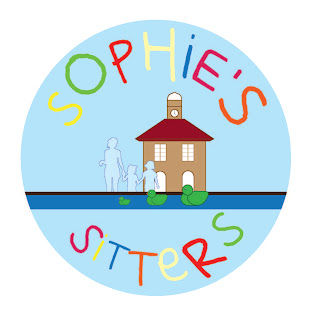
During the duration of work experience at Q-Design Ltd, it allowed me to boost my confidence and communication skills between the client and my employer. I thoroughly enjoyed working here for 5 days and would have preferred a longer placement. Over the period I was there, I designed for 3 clients around Teesside, LINX Project, Sophies Sitters and Parents 4 Change. My LINX Project was a fully printed final that went to the clients based in Hemlington who worked with young and old teenagers.
 |
| SOPHIES SITTERS YARM - HAYLEY SIMPSON 2012 |
 |
| PARENTS 4 CHANGE AWARENESS & ACTION 'KID WITH ATTITUDE CAR SIGN' MIDDLESBROUGH - HAYLEY SIMPSON 2012 |
 |
| HEMLINGTON DETACHED YOUTH WORK PROJECT (LINX)- HAYLEY SIMPSON 2012 |
Monday, 14 November 2011
PENGUIN RESEARCH
Sketchbook Research
This is a page from my Penguin Sketchbook showing how I work and find an idea through the use of research. I have included various novels that relate with colour and also a grid structure that makes the book look professionally and also successful.
 |
| SKETCHBOOK - HAYLEY JADE SIMPSON 2011 |
Tuesday, 8 November 2011
CONTRASTING BRANCHES


Currently in my Editorial lesson and I have drawn a picture related to my research for my Penguin book cover. My idea came from 'In The Woods - Tana French' and I have used the branches to experiment with how image could represent the words. I have added another image showing some adjustments on Photoshop. I used the level tool to create a more dark and sinister pattern.
My original design was created using pencil drawn over with fineliner then added water to create a smudged effect on the branches. I find this to be my best technique in creating a pen run perfectly.
Monday, 7 November 2011
PENGUIN - ONE FLEW OVER THE CUCKOO'S NEST
 |
| PENGUIN LOGO - JAN TSCHICHOLD 1948 |
Currently working on a Penguin Book Cover design brief for the book 'The One Who Flew Over The Cuckoo's Nest'.
From reading the synopsis the cover has to prove a very powerful point in order to work successfully and creatively. I have a limit of 4 weeks to come up and develop an idea which will be submitted for my final idea. I am looking very forward to the idea's that I can come up with during this project.
IMAGE: http://inevitablefragments.tumblr.com/post/1210161676/jan-tschichold-penguin-books-logo-1948
IMAGE: http://inevitablefragments.tumblr.com/post/1210161676/jan-tschichold-penguin-books-logo-1948
URBANOGRAPHY
 |
| URBANOGRAPHY - HAYLEY JADE SIMPSON 2011 |
The photo consists of graffiti on a telephone box outside my University. The colours are powerful and has attracted other students on the design. The simplicity of this has made it more powerful. People find graffiti a destruction of the environment but I find it to be an influence and creative aspect of a certain place.
Subscribe to:
Posts (Atom)