Tuesday, 22 May 2012

ECO-LABEL FASHION

Brief
A local fashion company specialising in creating economy clothing around the North East. The company were asking for a name that was trendy but also relates to their fashion clothing line. The company were only asking for a brand that could be applied to various platforms and medias.

My Designs
I wanted to generate an idea that would both show the companies economic values and fashion styles. The name Eco-Label is designed to make the company look and sound economic.


ECO LABEL FASHION - HAYLEY SIMPSON 2012

ECO LABEL FASHION - HAYLEY SIMPSON 2012

YCN AWARDS 2012

Brief
YCN Awards host a number of briefs open to students around the UK for large companies who either need a re-brand or a new promotional campaign to promote their products. This year was Graze.com, a healthy snack company who deliver postal boxes full of little snacks and treats to your office or home. Graze we asking for a re-brand that would be used to promote themselves to new customers. Once you had re-branded you were asked to apply this to the postal boxes that would be delivered to their customers and the design.

My Designs
I wanted to create a design that would bring the original logo back to nature. I decided upon changing the lettering to look similar to grass blades using a thin green stroke. A ladybug was then added along the G to represent the blade of grass and the closeness to nature that the company offer. The inside of the box was kept original with a similar image but the logo placed on the top left corner.


'14/05/2013 thoughts?
Looking back at this brief I should have re-designed the various leaflets that are supplied with the first box offering new promotions and discounts. I should have also developed the inside of the box to be more illustrative or creative to suit and fit my current portfolio.'


YCN AWARDS 2012 - HAYLEY SIMPSON 2012

PENGUIN BOOK AWARDS COMPETITION 2012

Brief
Penguin Book Awards host a competition to students to design book covers for upcoming releases of old novels. This years chosen novel was 'One Flew Over The Cuckoo's Nest'. This is an amazing read with a film that followed on starring Jack Nicholson. The story is written within a hospital ward for mentally ill patients run by Nurse Ratched.

My Design
The representation of cogs is to represent the cold, darkness of the hospital that these patients were subject to. With Nurse Ratched as the boss of the ward, she was described to run like clockwork with the patients.


ONE FLEW OVER THE CUCKOOS NEST - HAYLEY SIMPSON 2012


Monday, 16 April 2012

WORK EXPERIENCE AT Q-DESIGN LTD

Q-Design Ltd
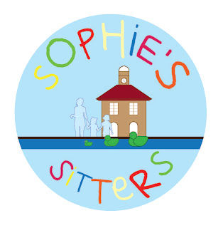
During the duration of work experience at Q-Design Ltd, it allowed me to boost my confidence and communication skills between the client and my employer. I thoroughly enjoyed working here for 5 days and would have preferred a longer placement. Over the period I was there, I designed for 3 clients around Teesside, LINX Project, Sophies Sitters and Parents 4 Change. My LINX Project was a fully printed final that went to the clients based in Hemlington who worked with young and old teenagers. 

SOPHIES SITTERS YARM - HAYLEY SIMPSON 2012


PARENTS 4 CHANGE AWARENESS & ACTION 'KID WITH ATTITUDE CAR SIGN' MIDDLESBROUGH - HAYLEY SIMPSON 2012


HEMLINGTON DETACHED YOUTH WORK PROJECT (LINX)- HAYLEY SIMPSON 2012

Monday, 14 November 2011

PENGUIN RESEARCH

Sketchbook Research

This is a page from my Penguin Sketchbook showing how I work and find an idea through the use of research. I have included various novels that relate with colour and also a grid structure that makes the book look professionally and also successful.


SKETCHBOOK - HAYLEY JADE SIMPSON 2011

Tuesday, 8 November 2011

CONTRASTING BRANCHES


Currently in my Editorial lesson and I have drawn a picture related to my research for my Penguin book cover. My idea came from 'In The Woods - Tana French' and I have used the branches to experiment with how image could represent the words. I have added another image showing some adjustments on Photoshop. I used the level tool to create a more dark and sinister pattern. 

My original design was created using pencil drawn over with fineliner then added water to create a smudged effect on the branches. I find this to be my best technique in creating a pen run perfectly. 

Monday, 7 November 2011

PENGUIN - ONE FLEW OVER THE CUCKOO'S NEST

PENGUIN LOGO - JAN TSCHICHOLD 1948


Currently working on a Penguin Book Cover design brief for the book 'The One Who Flew Over The Cuckoo's Nest'.

From reading the synopsis the cover has to prove a very powerful point in order to work successfully and creatively. I have a limit of 4 weeks to come up and develop an idea which will be submitted for my final idea. I am looking very forward to the idea's that I can come up with during this project.


IMAGE: http://inevitablefragments.tumblr.com/post/1210161676/jan-tschichold-penguin-books-logo-1948